
The challenge was to create a new novel cover for Truman Capote who was best known for creating “In Cold Blood”. After penguin reviewed the older covers, they wanted the cover to be something fresh, different and unique. I simply wanted to relate to the story and the area of where the event happened. So I’ve study not limiting to the story but looked at kansas, the theme, people of kansas, the scenery and even the seal of kansas which I believe reflect the colours choice and the illustration on the cover of the book.
Inspirations
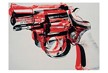
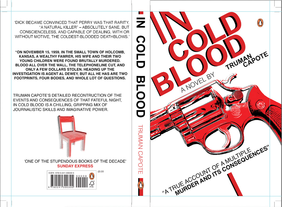
My work ideas and development started when I went to Yorkshire Sculpture Park and at the time they were exhibiting Andy Warhol's work. This is where I based my inspiration from, especially that revolver design.
I experimented with the title but decided to carry on with it digitally
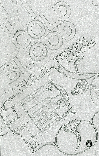
Original Design
Half way into designing this, my computer crashed, and lost nearly everything, so I decided start from scratch. As well what effected my decision was that I've read the book so the specifically the gun (revolver) it wasn't used in the story, so it didn't make the cut, regardless if it was aestheically pleasing to the eye.
In this it matches the profile of the story, then i decided to mess around with perspective of the title, text and character which ultimate lead to the completion of my first official design.
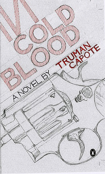
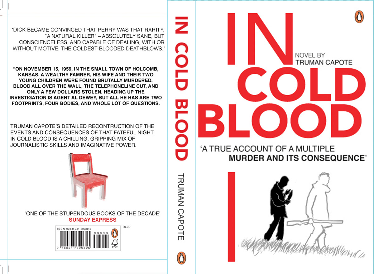
First Official Design
This was my first official design (since the one above was only experiments) for the book's cover but I felt it was to generic and too plain due to the background colour. It just didn't capture the colours, feeling of 'In Cold Blood's story. Although I enjoyed designing this, experimenting with the perspective of the title, designing the characters.
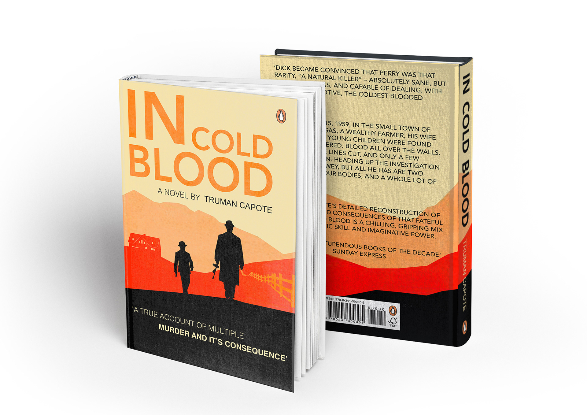
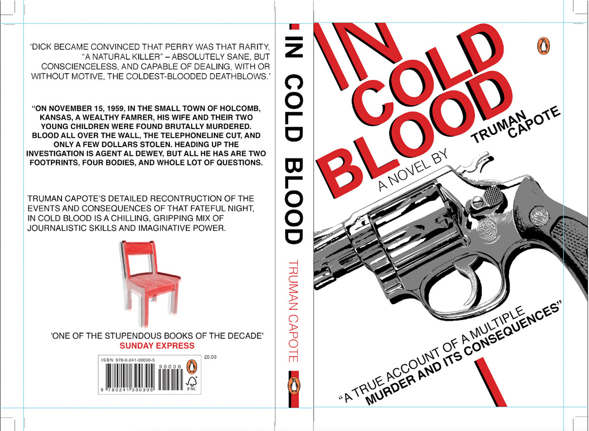
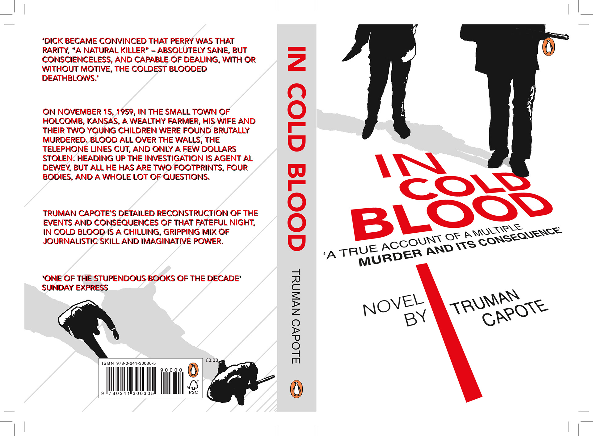
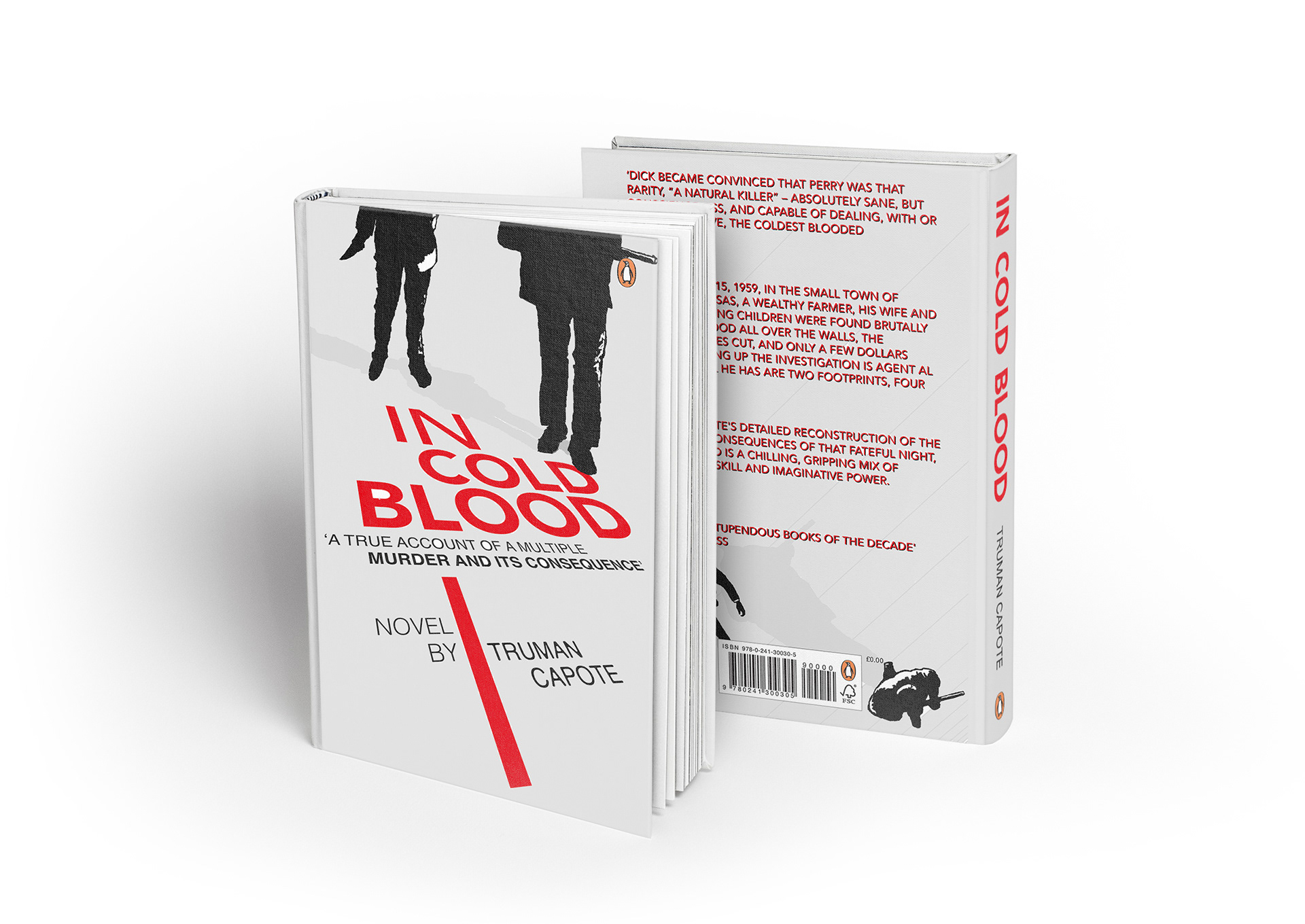
Official Final Design
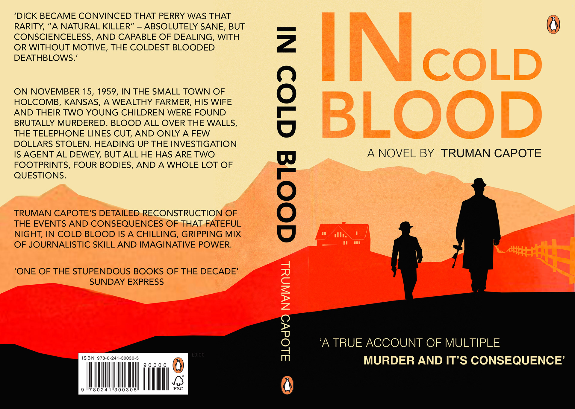
This is my final design for Penguins's 'In Cold Blood' novel. I decided to go with minimalism and use 5 colour while using texture in the background.